APSF Royal Oak 15500 in White: The Brightest Way to Wear a Classic
APSF's Royal Oak 15500, tested in white and also offered in blue, black and grey, pairs a strong case with a 4302-type movement. Owners flag hacking and finishing.
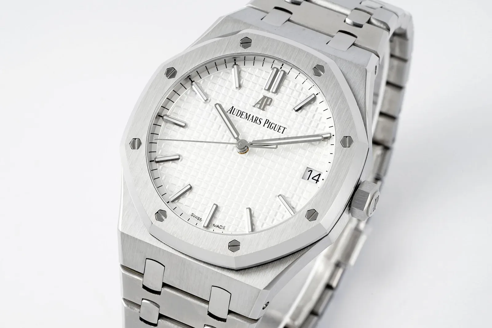
Most people picture the steel 15500 in blue. It’s the colour on the posters, the one everyone argues about and the one factories struggle to match. The white dial is quieter, crisper and arguably smarter, and it may also be the easier one to get right.
APSF’s 15500 is offered in white, blue, black and grey. Owner reviews tend to focus on blue and grey, but most of what they say applies across the range: a well-built case and bracelet, a solid movement and a few rough edges that are worth checking. Here’s how it stacks up, with the white dial in mind.
Why this watch matters
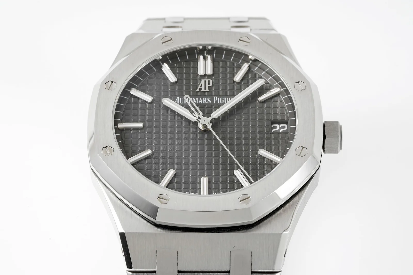
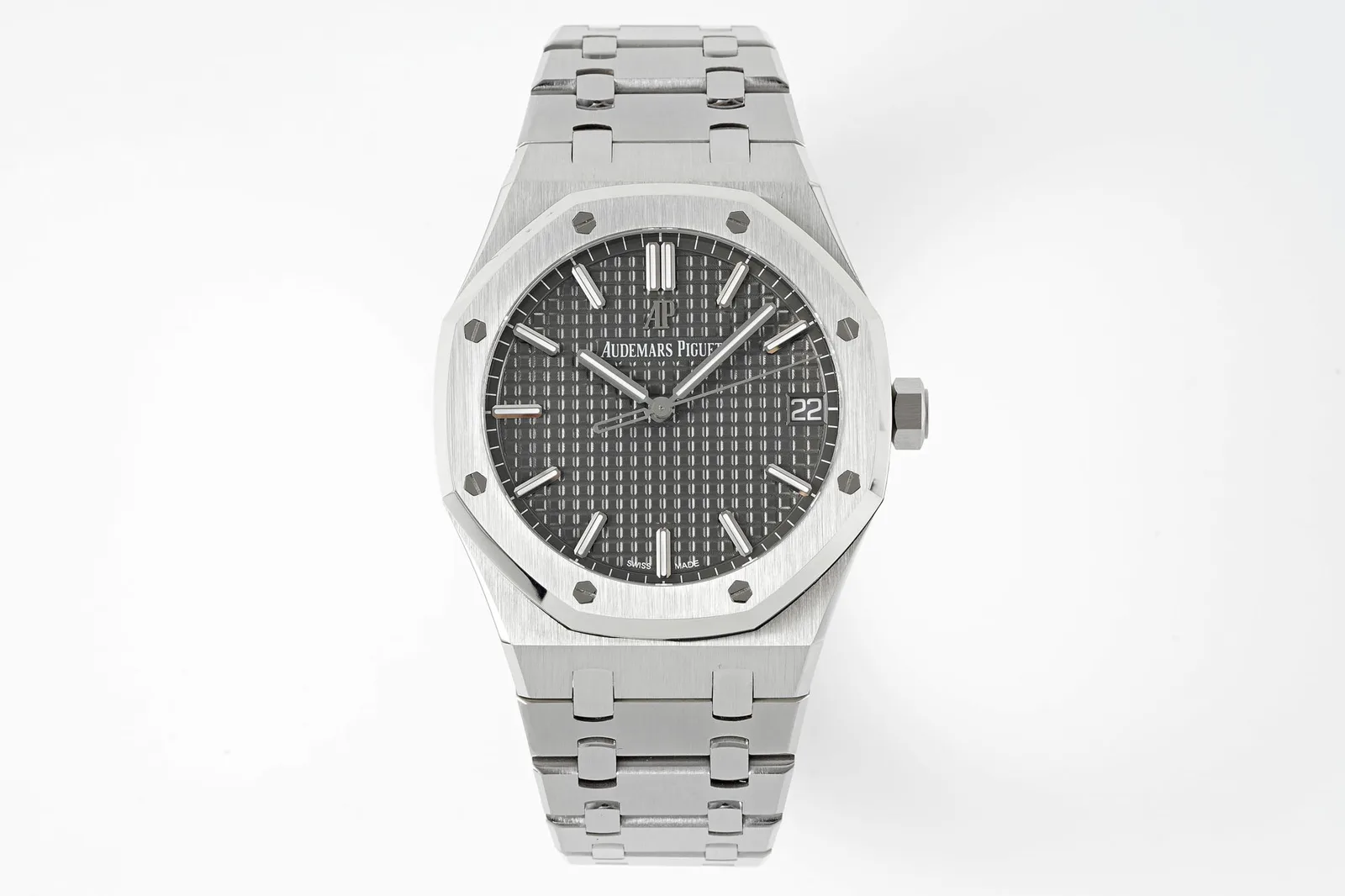
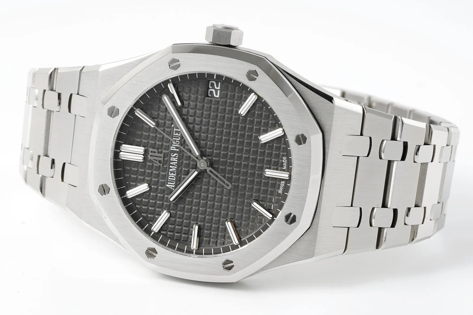
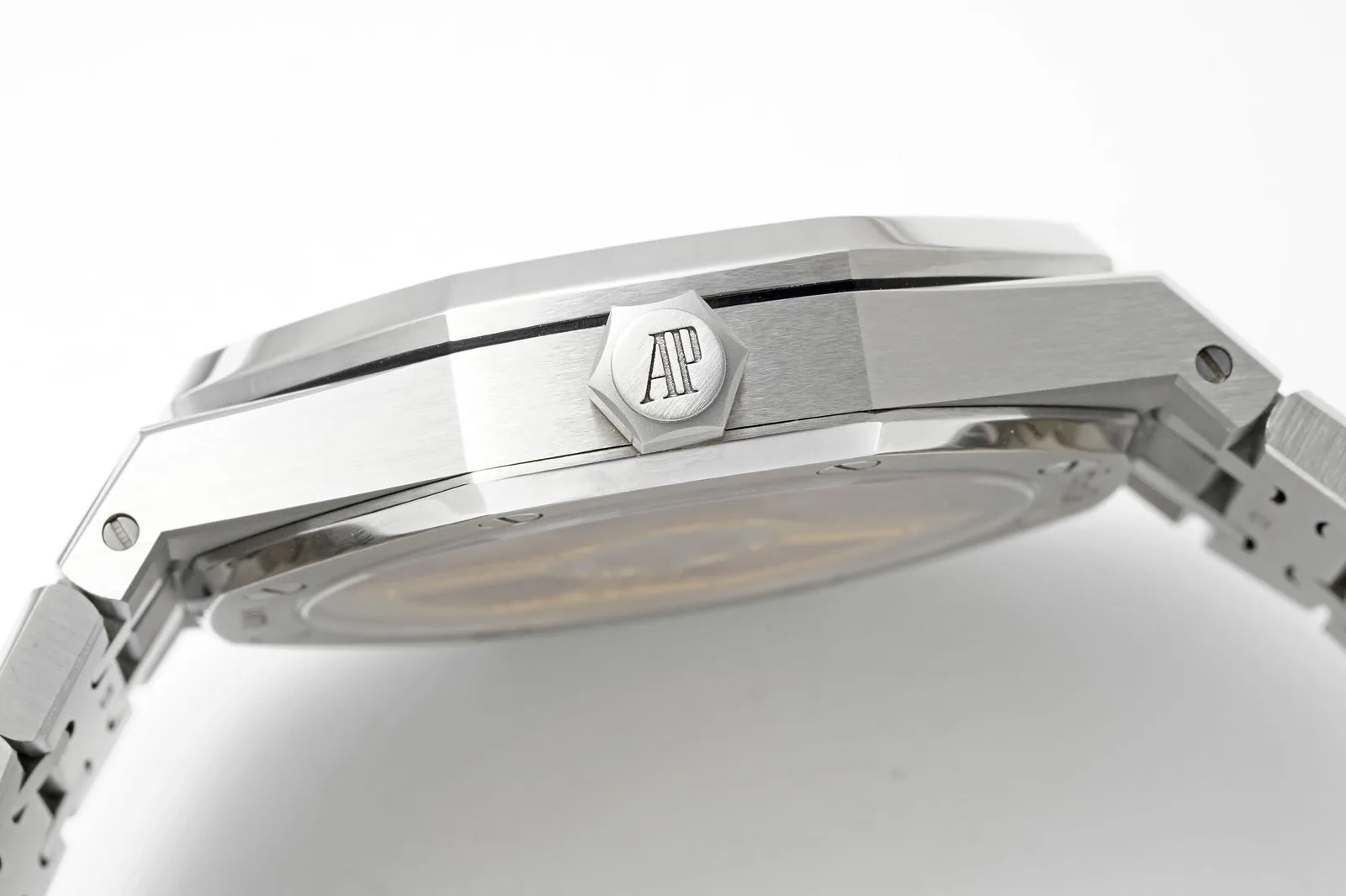
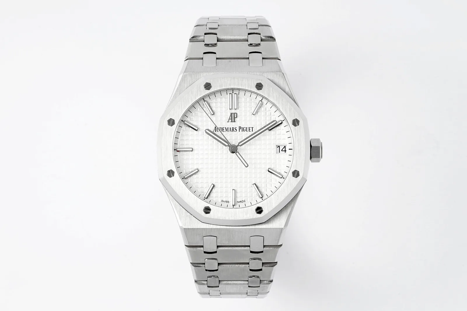
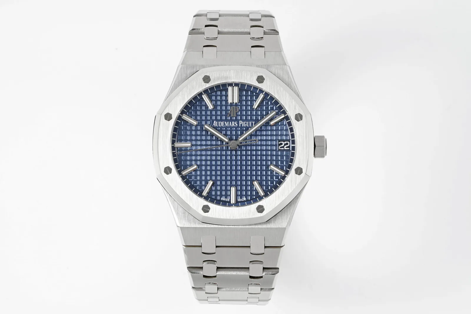
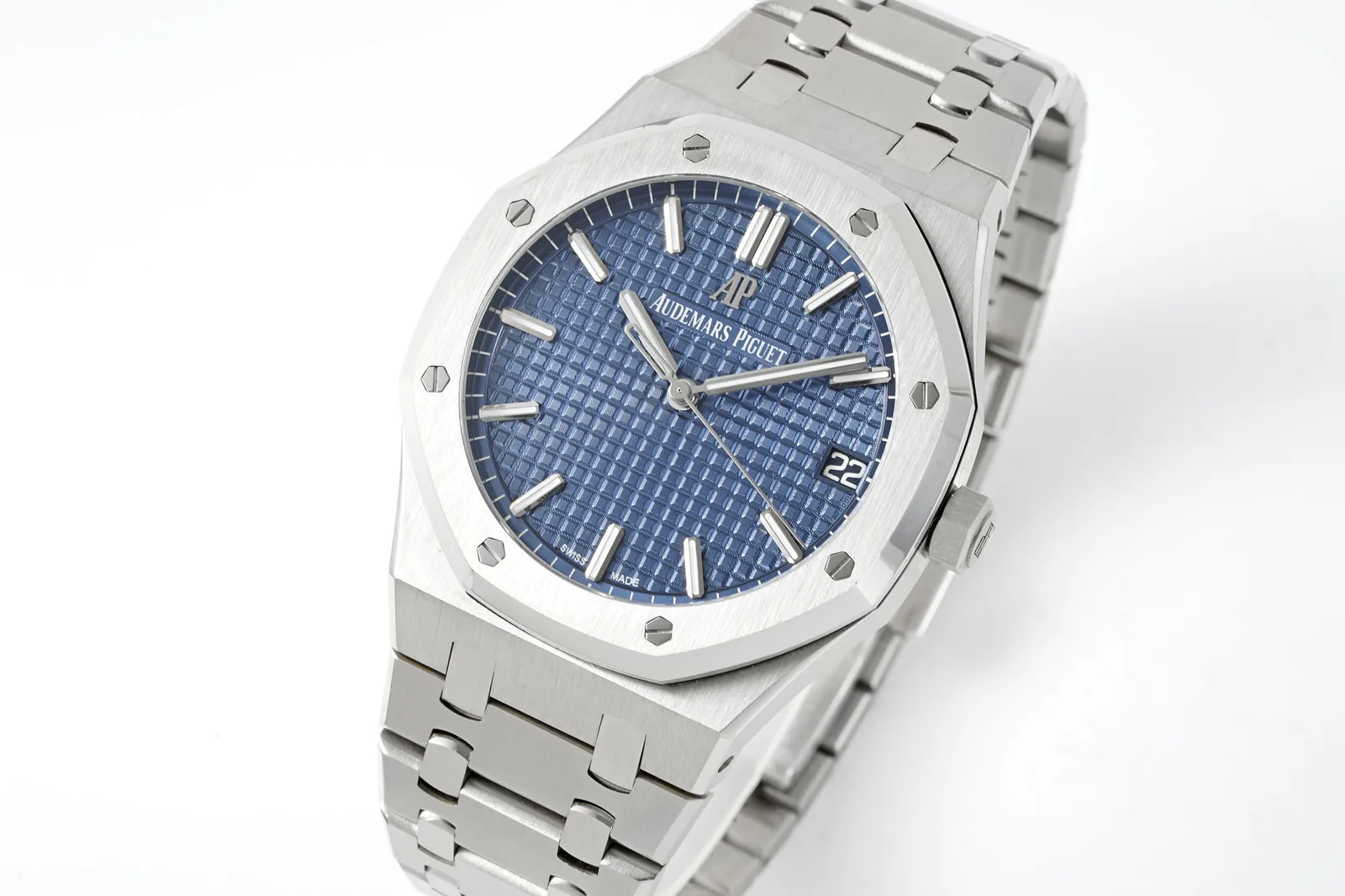
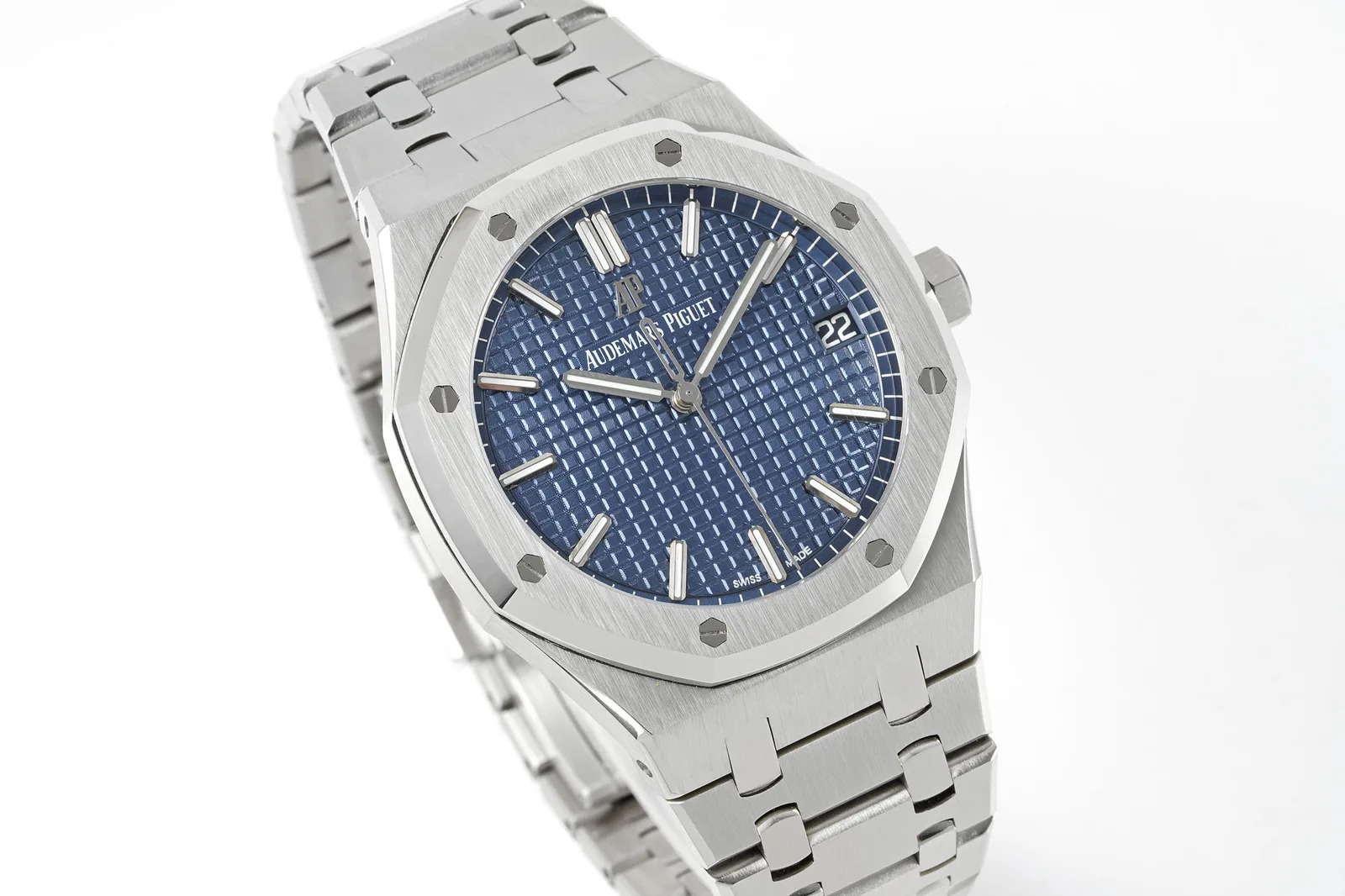
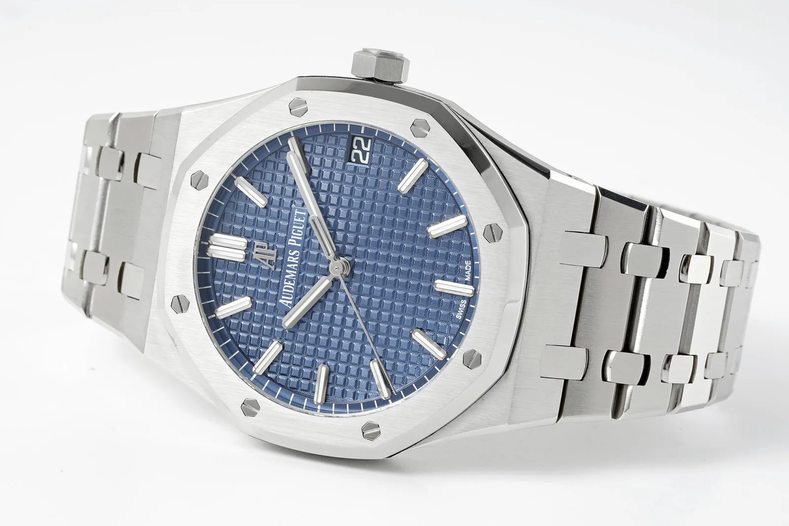
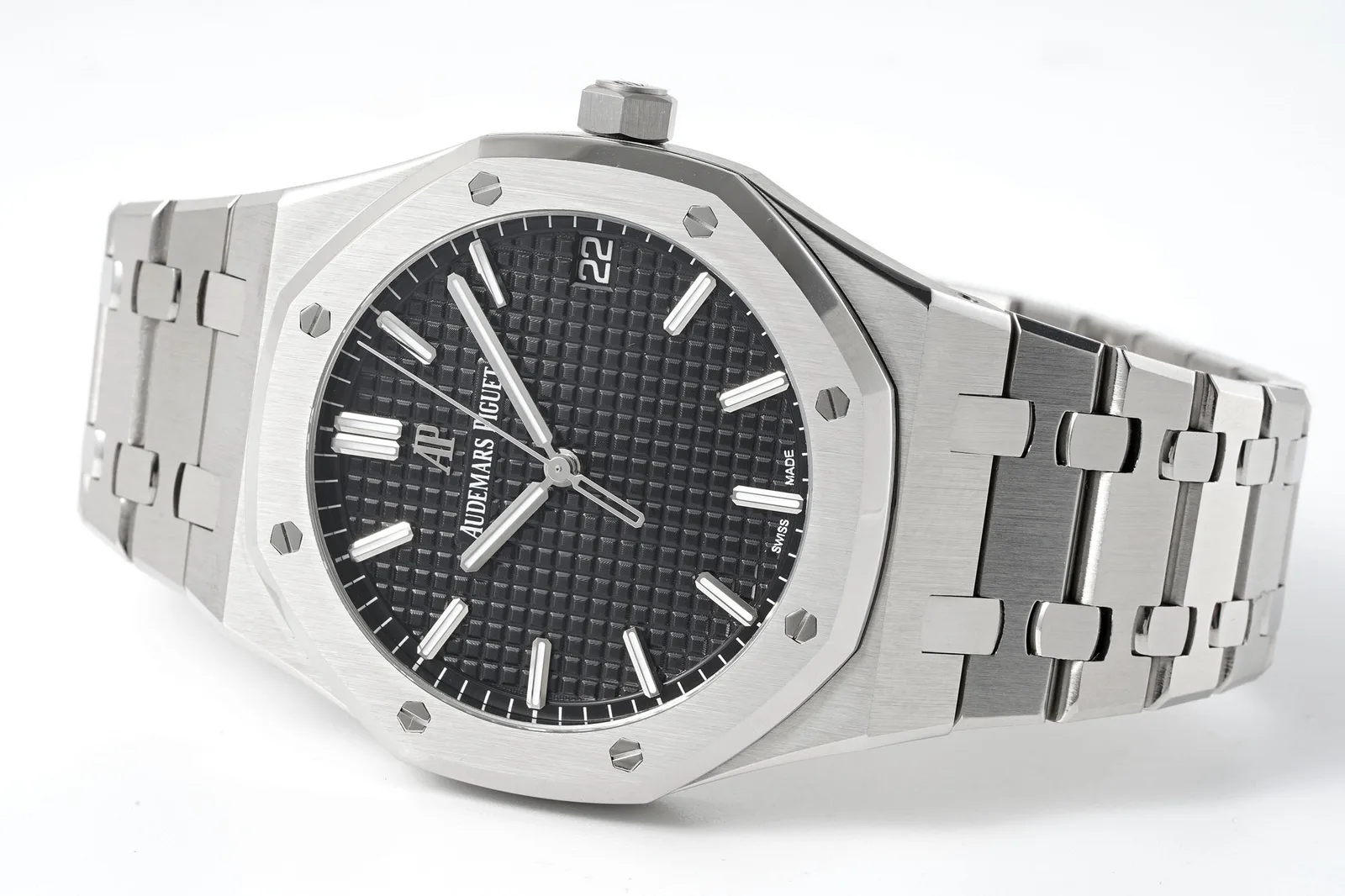
The genuine 15500 was the steel, time-and-date heart of the collection for several years: 41 mm wide, about 10.4 mm thick, with the octagonal bezel, eight visible screws and the integrated bracelet. Inside is the 4302 calibre, with roughly 70 hours of reserve. The dial has the familiar raised waffle pattern, in blue, black, grey or white.
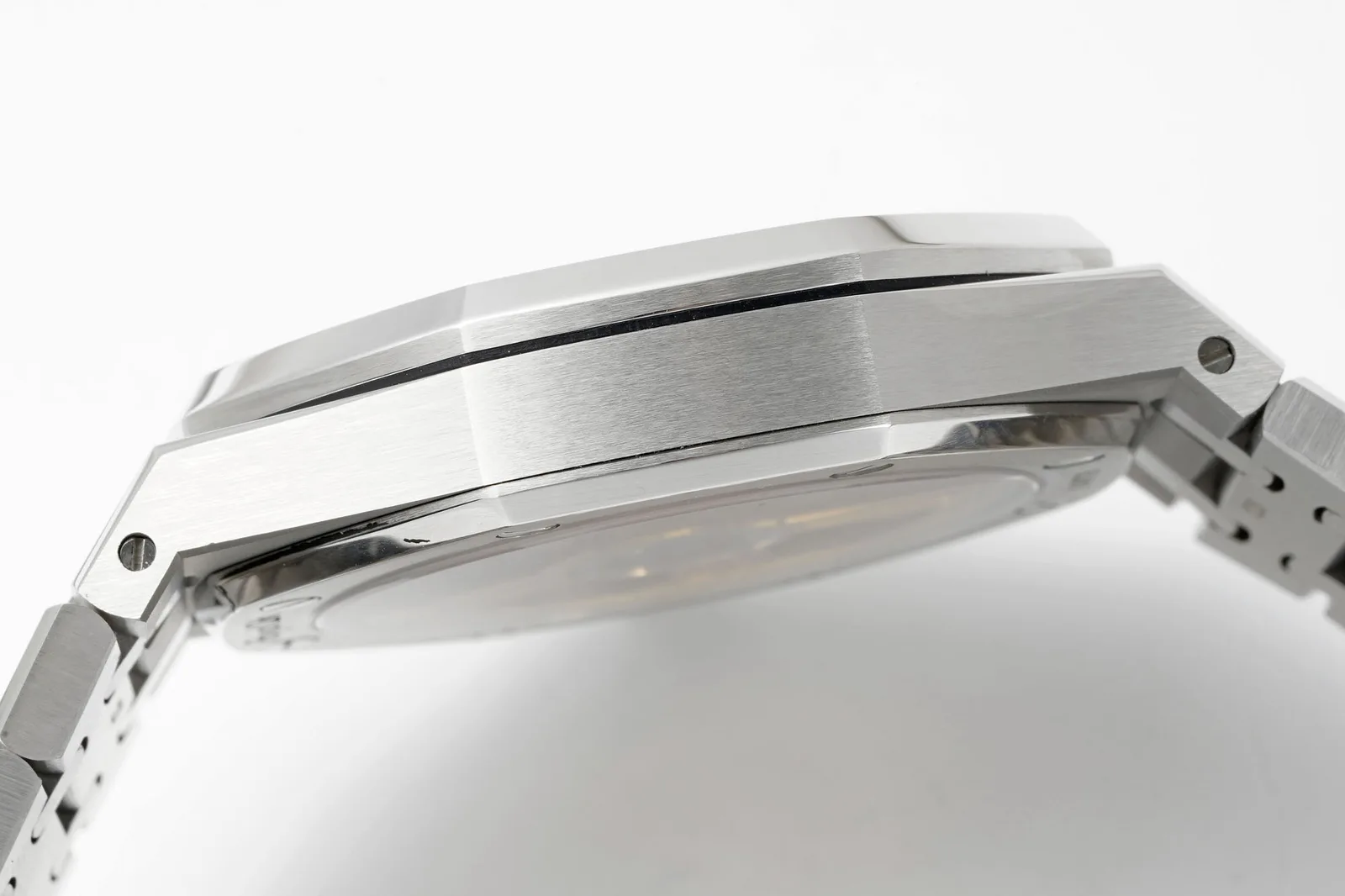
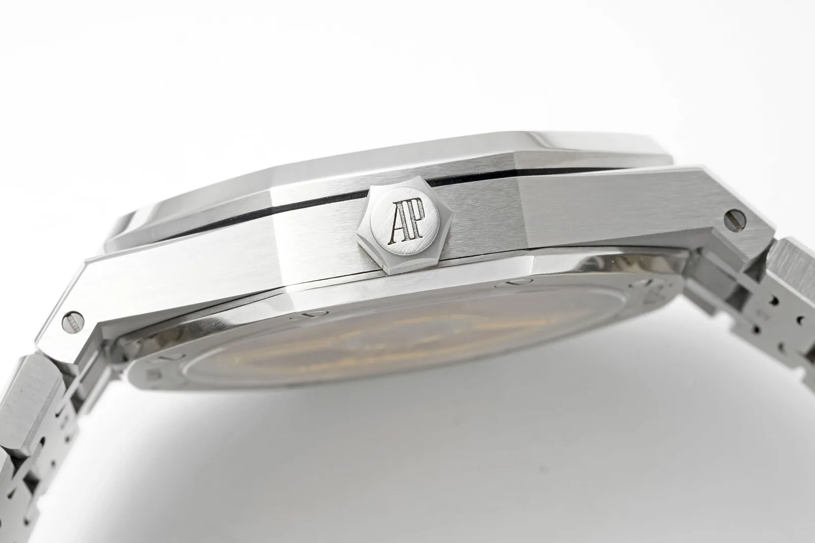
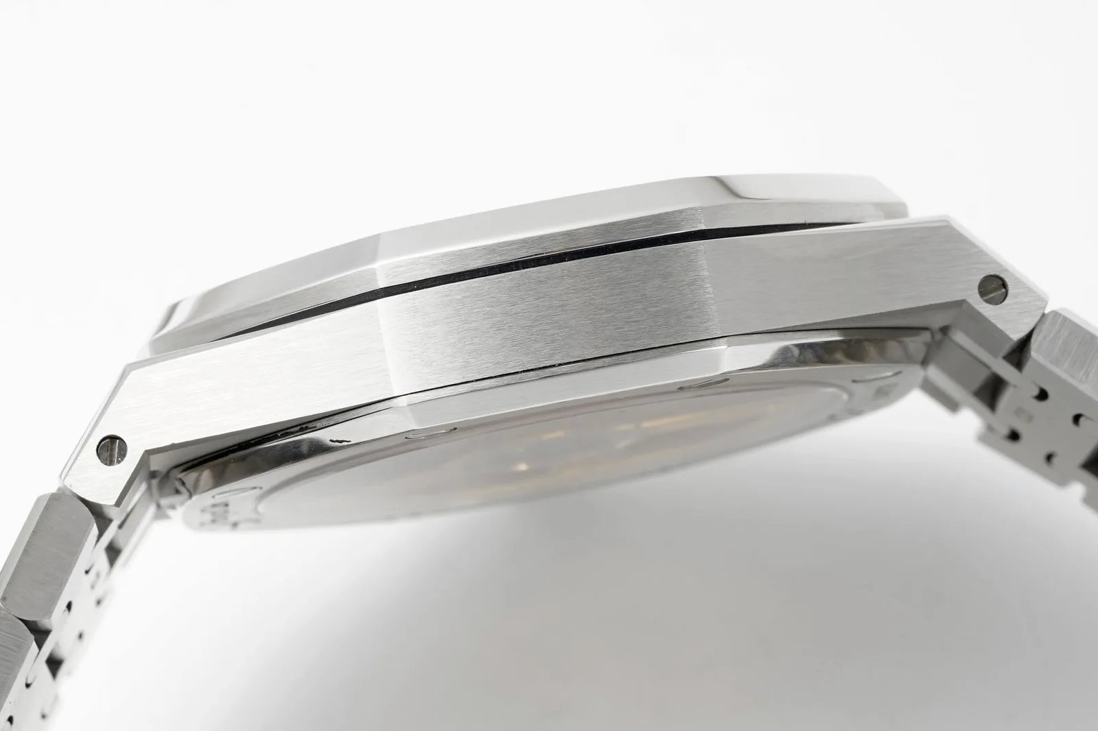
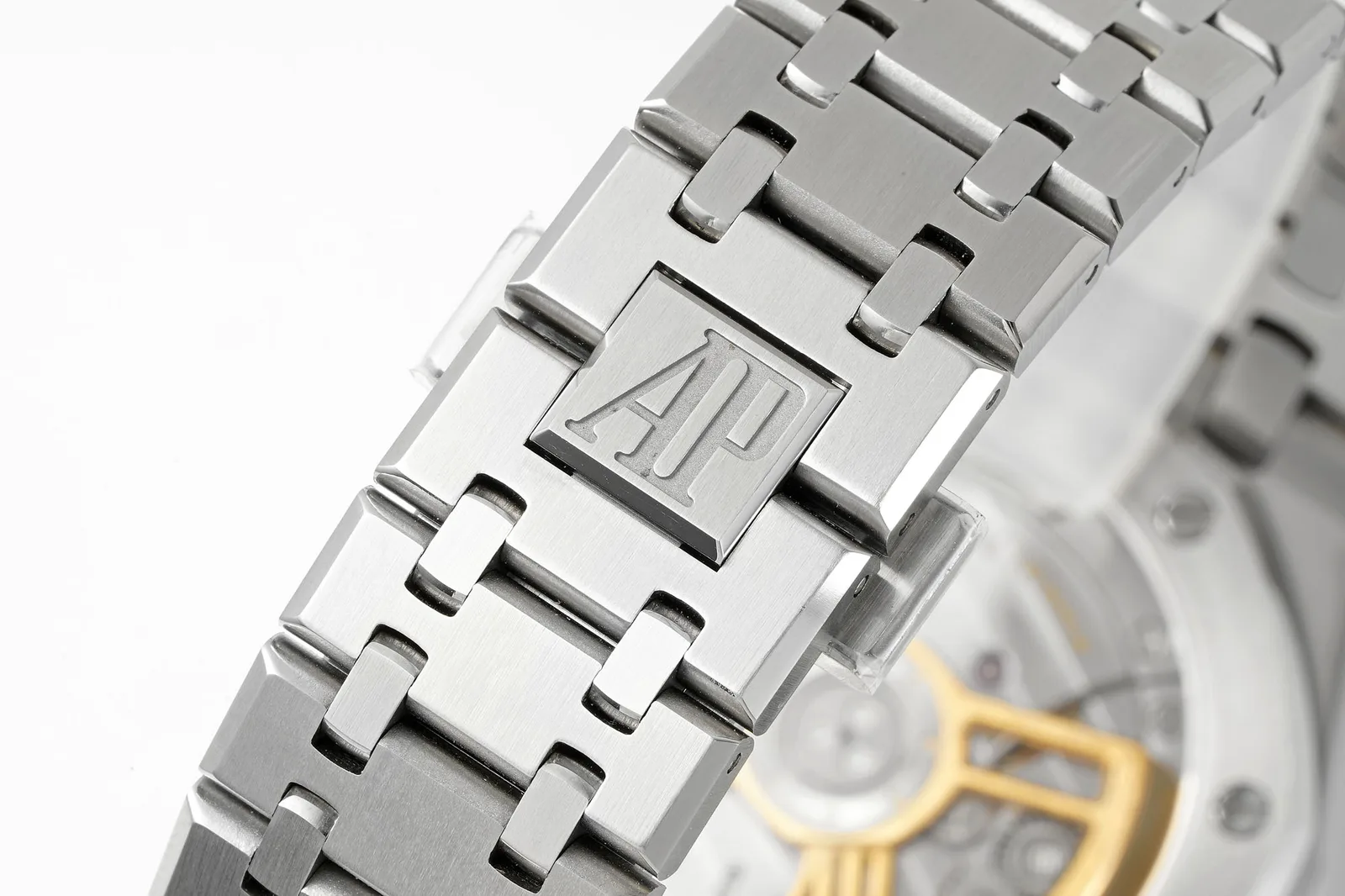
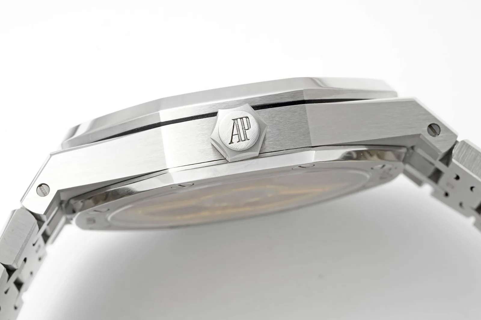
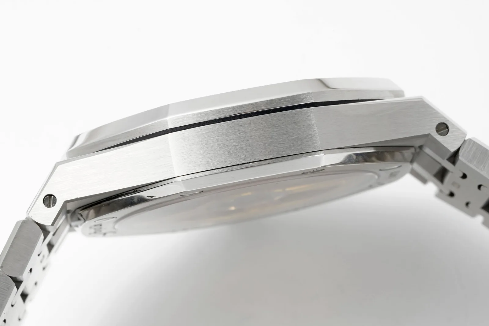
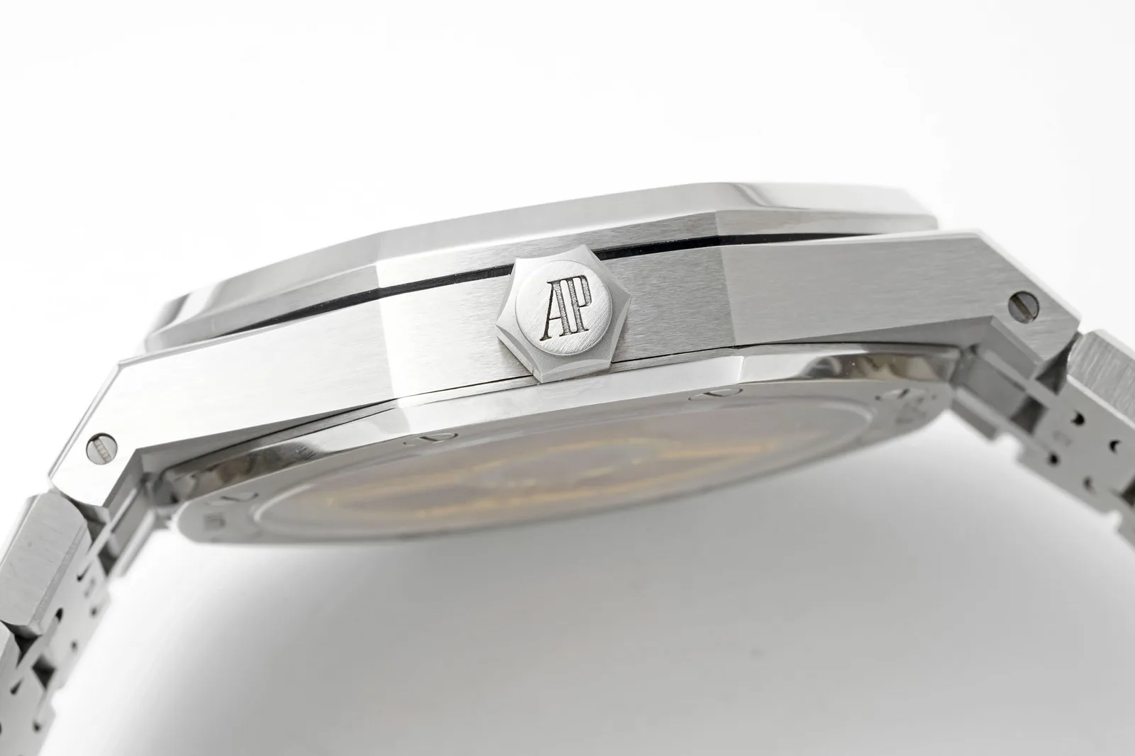
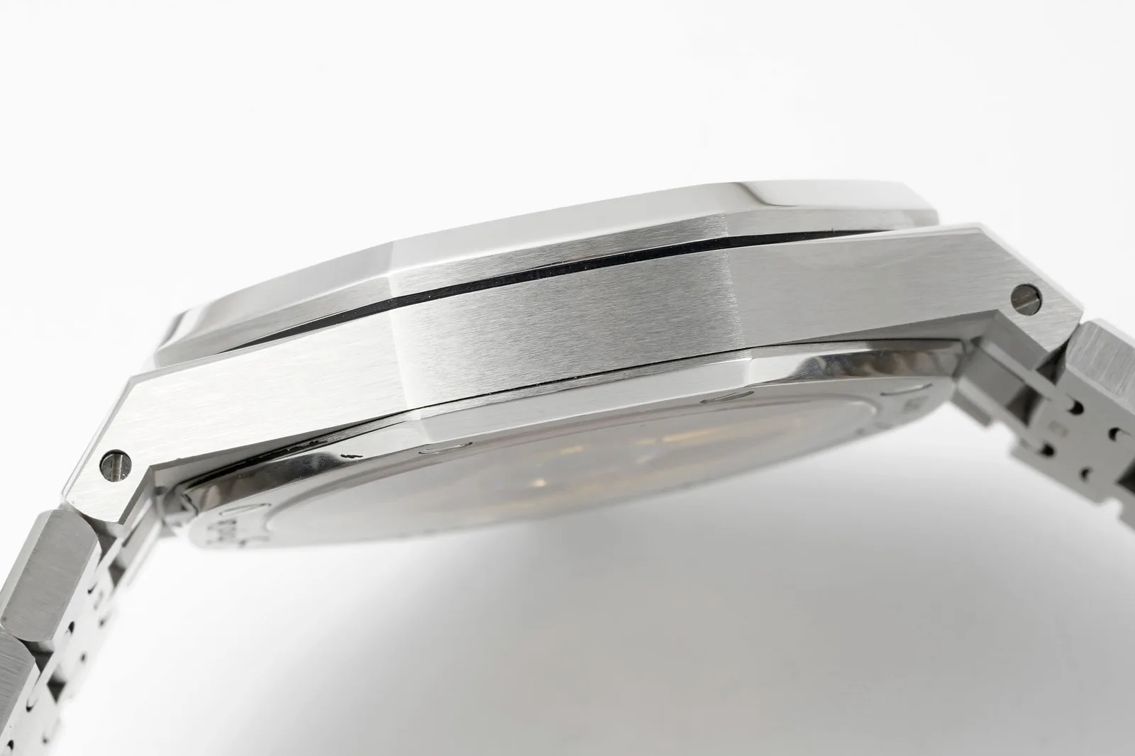
The design is famously unforgiving. Its value lies in brushed and polished surfaces meeting at sharp edges, so finishing matters more than almost anything else. A slightly soft chamfer or a coarse brush pattern shows from across the room.
The factory and the white dial
APSF’s version is sold as a V2 with a 4302-type movement. The factory’s listing claims dimensions taken from a genuine watch, 41 by 10.4 mm, and an end-link fit that matches the genuine watch. Those are the factory’s claims, and we’d treat them as such.
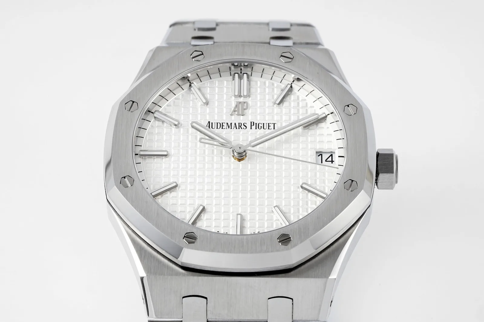
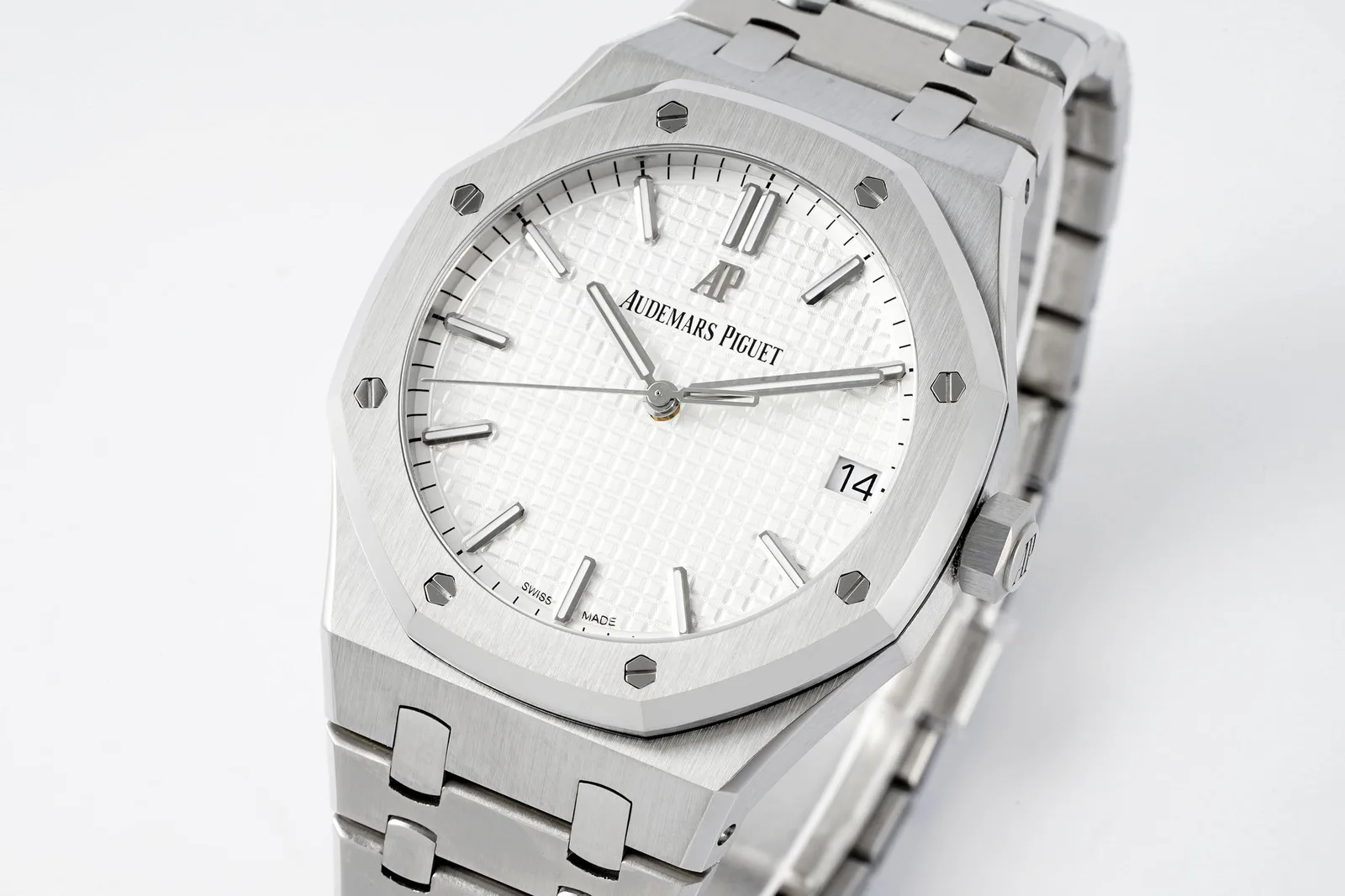
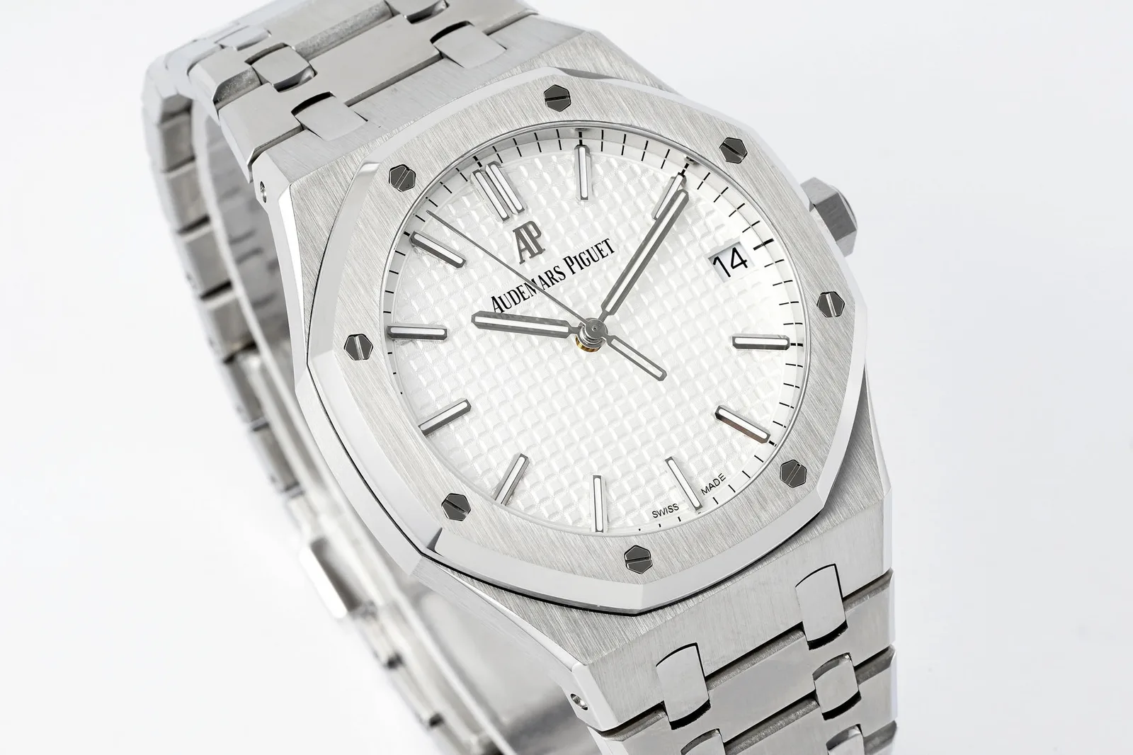
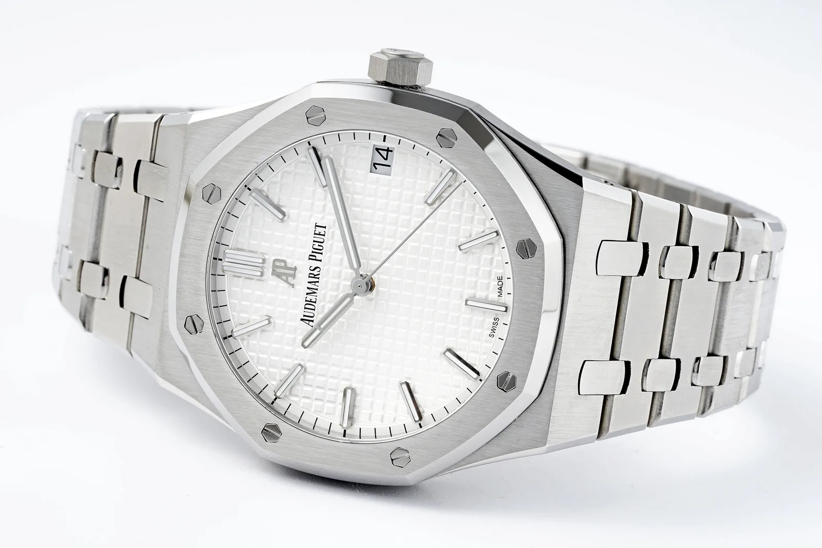
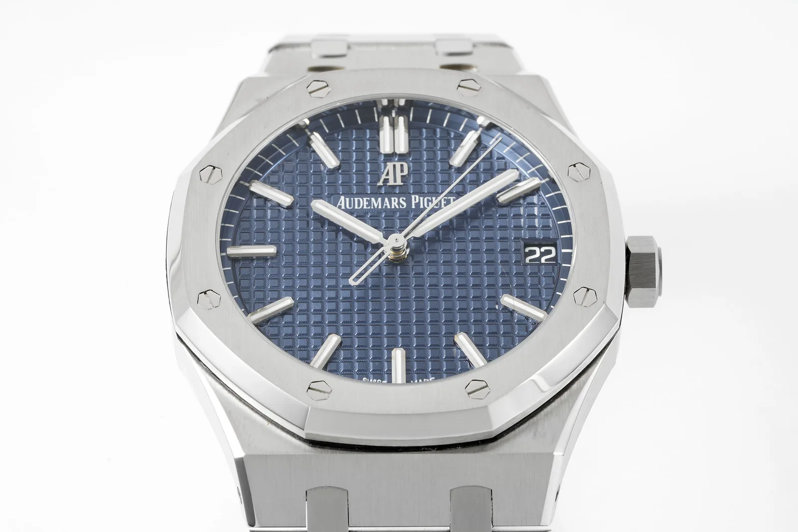
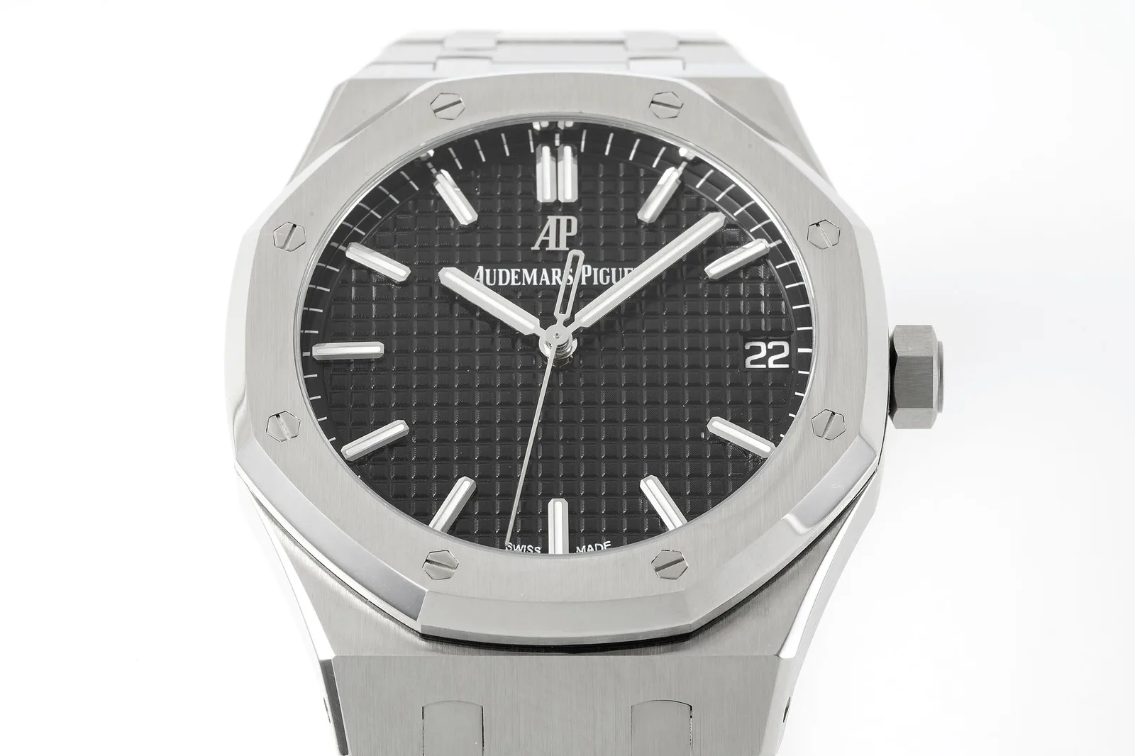
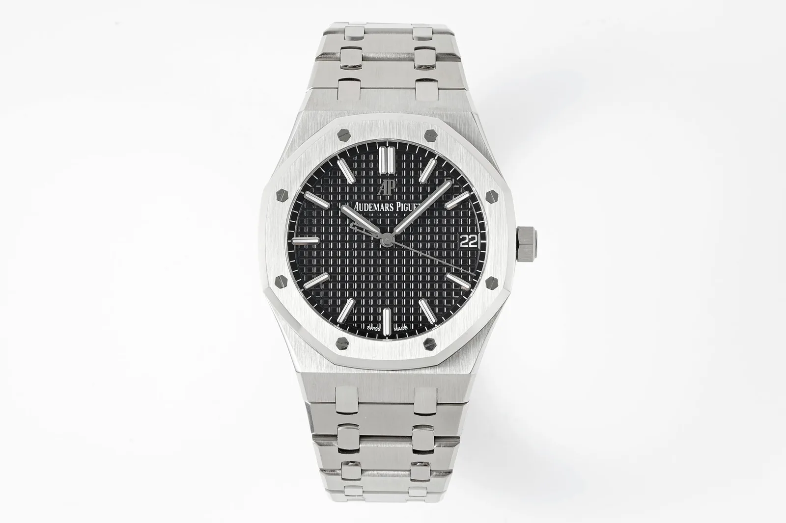
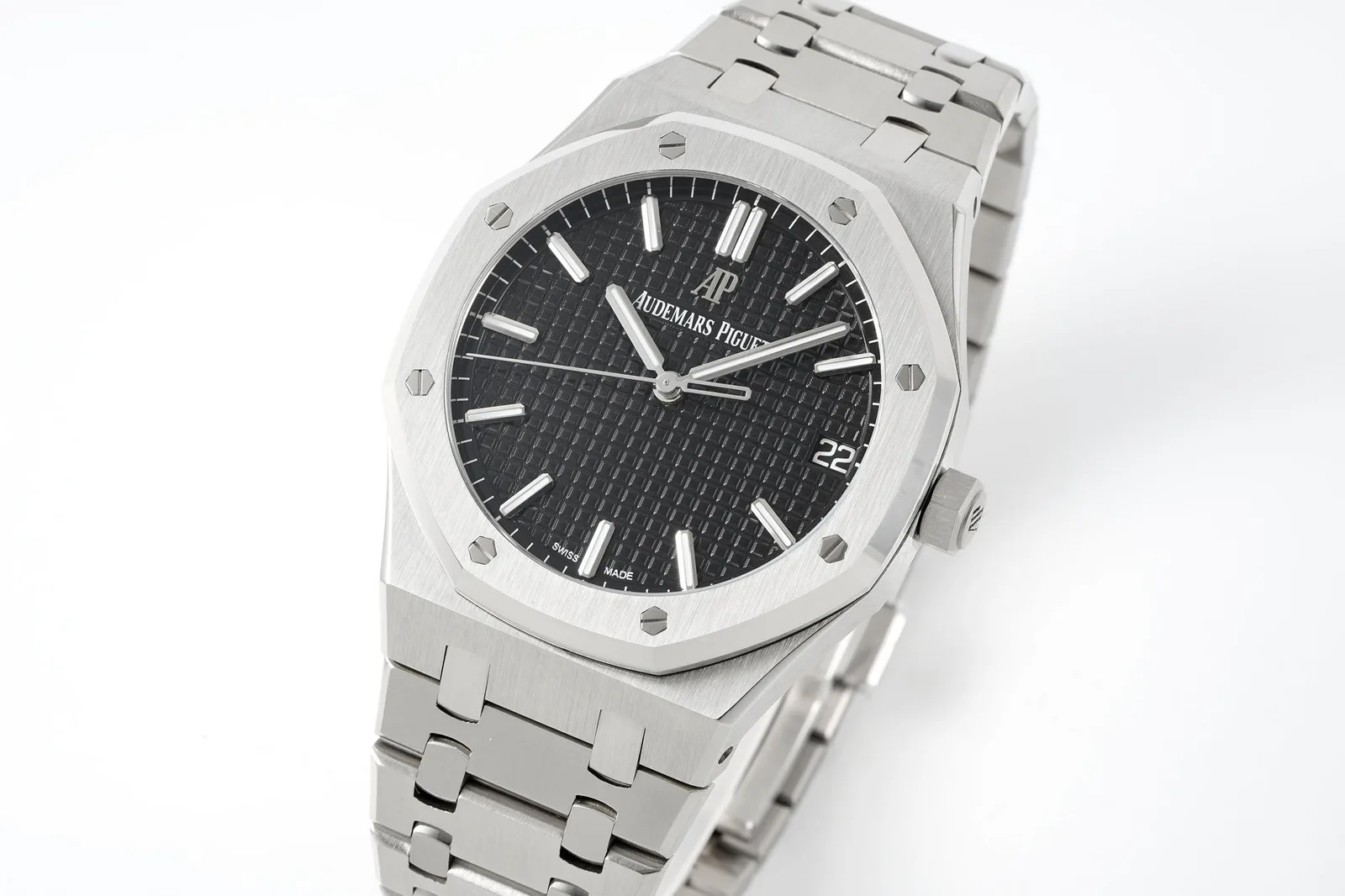
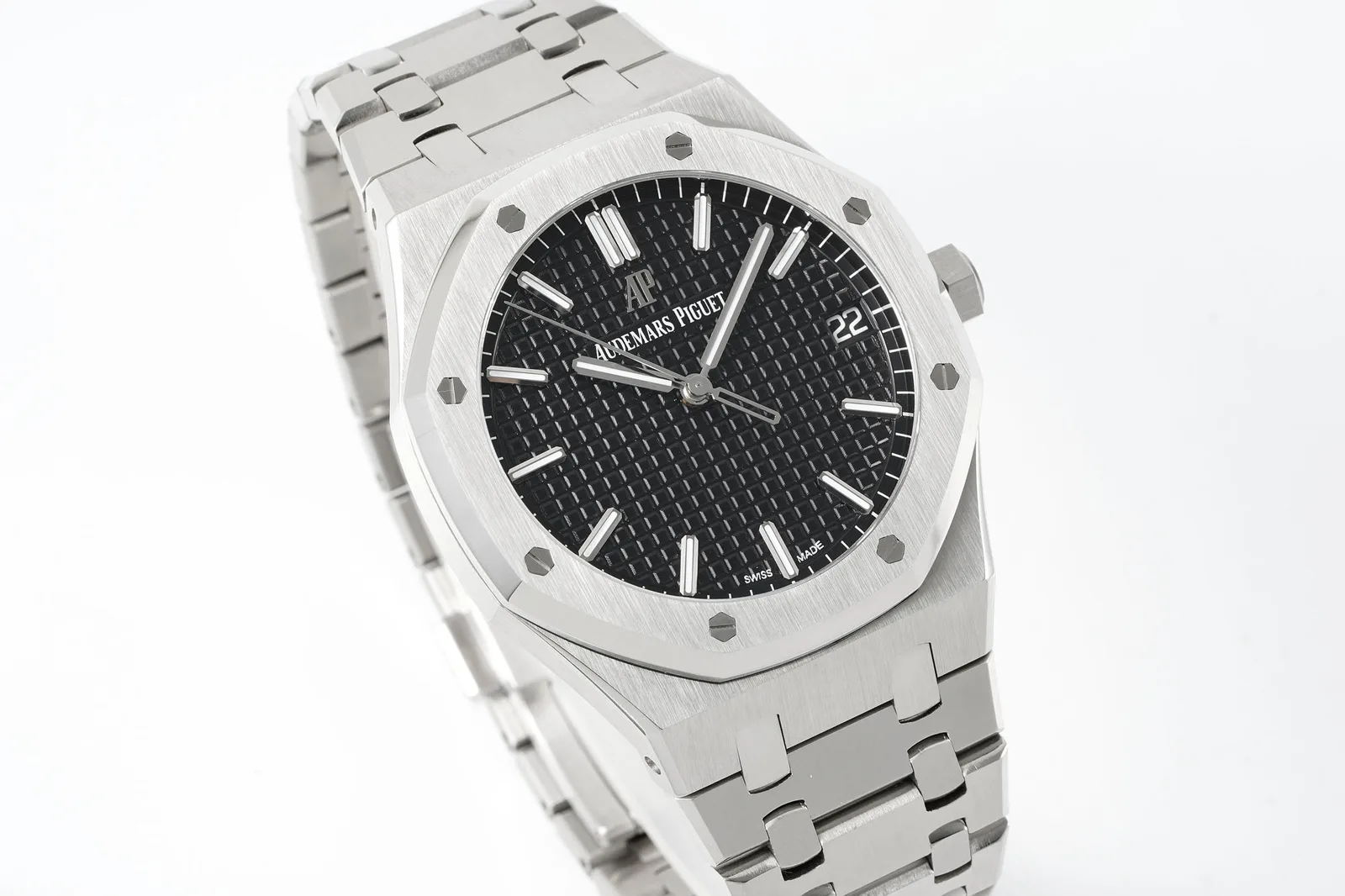
White is a sensible choice for this reference. On blue dials, owners constantly debate the precise shade: one owner had his blue dial professionally recoloured because the stock dial looked too light. White has no such problem. The challenge is the texture and the applied markers, since a white dial makes the waffle pattern and the polished indices the main event. The catalog photos show a crisp, bright white with sharp texture and polished markers, but studio photos are flattering, so judge real photos before buying.
Case and bracelet
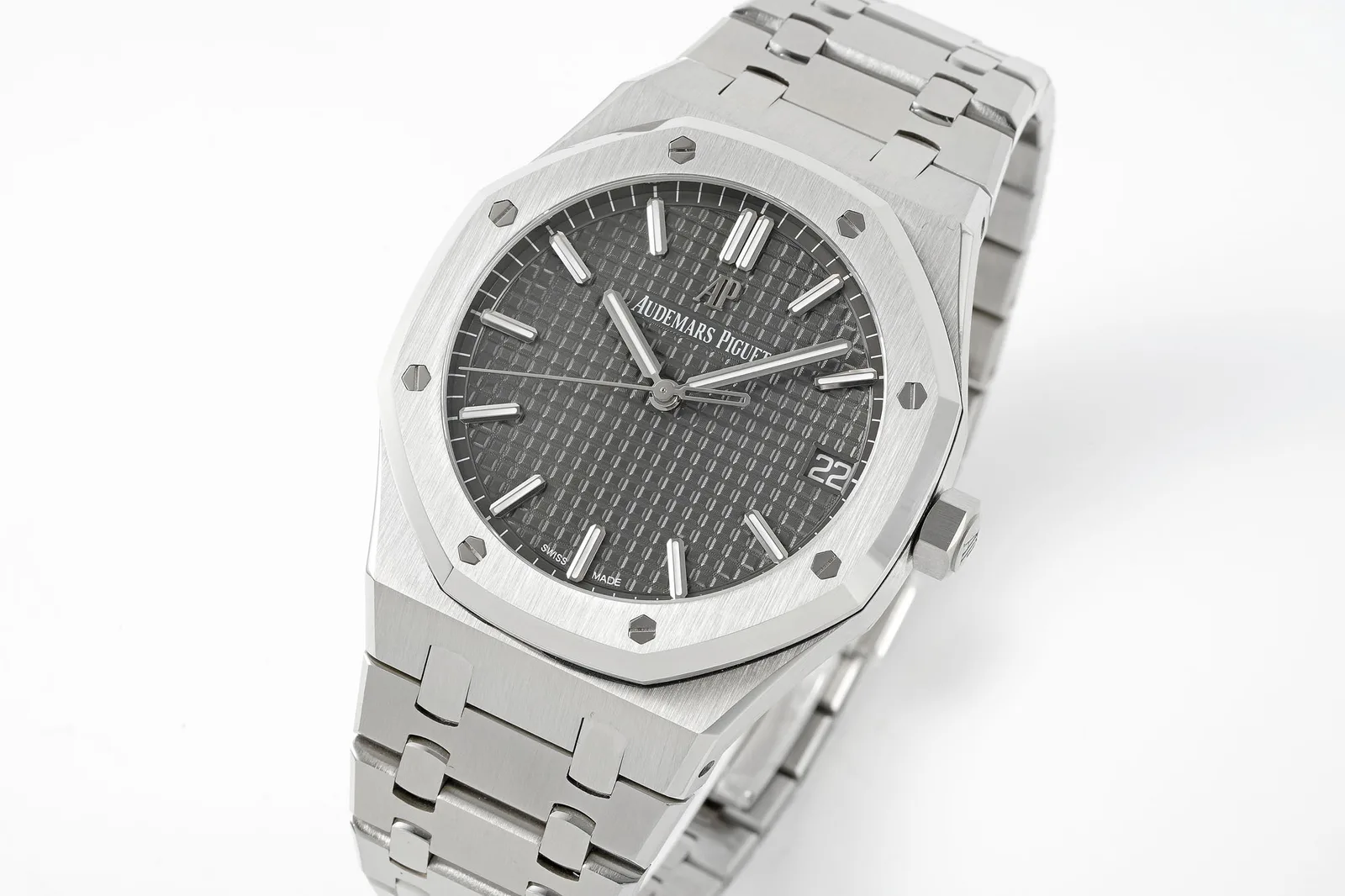
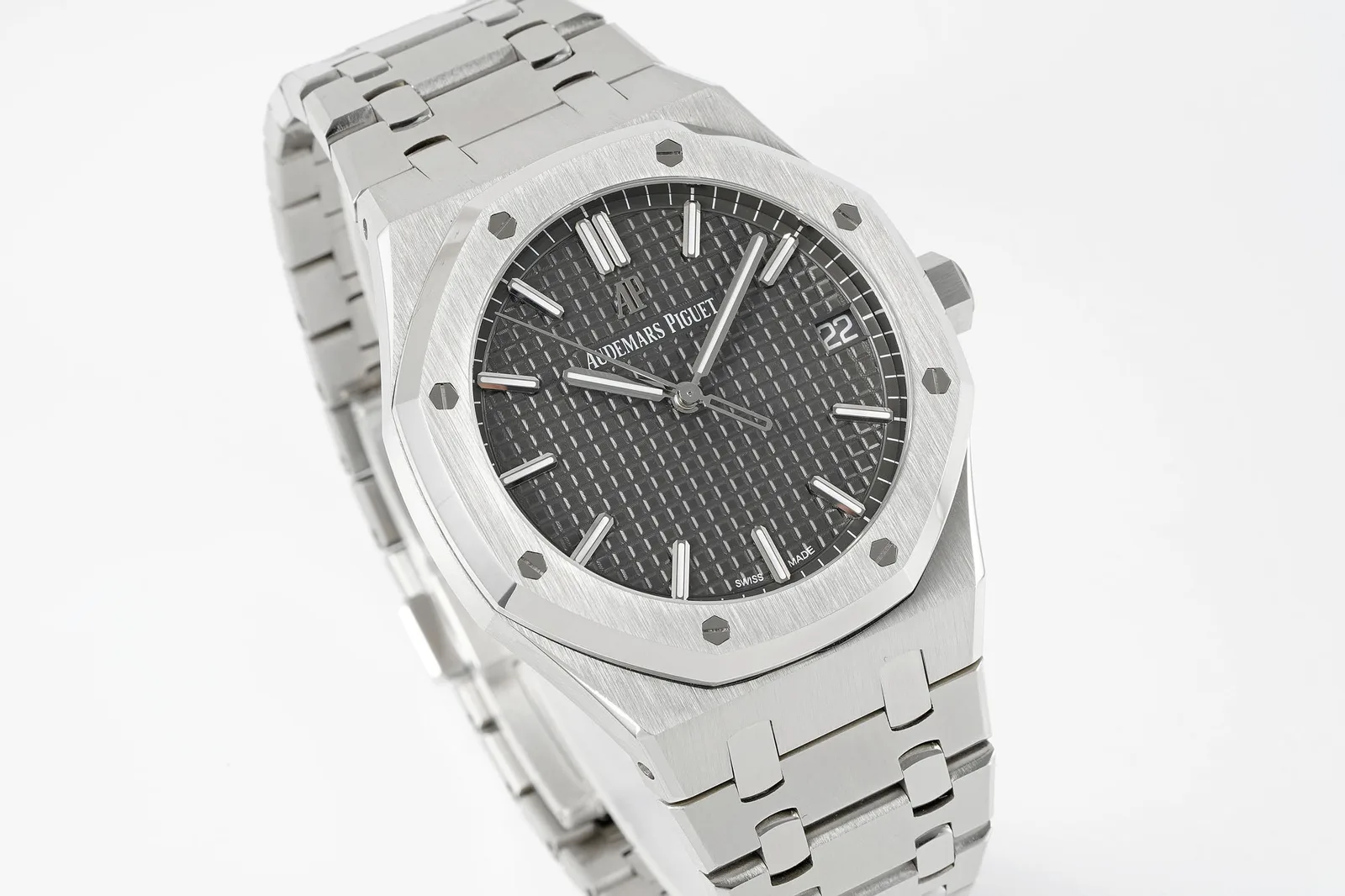
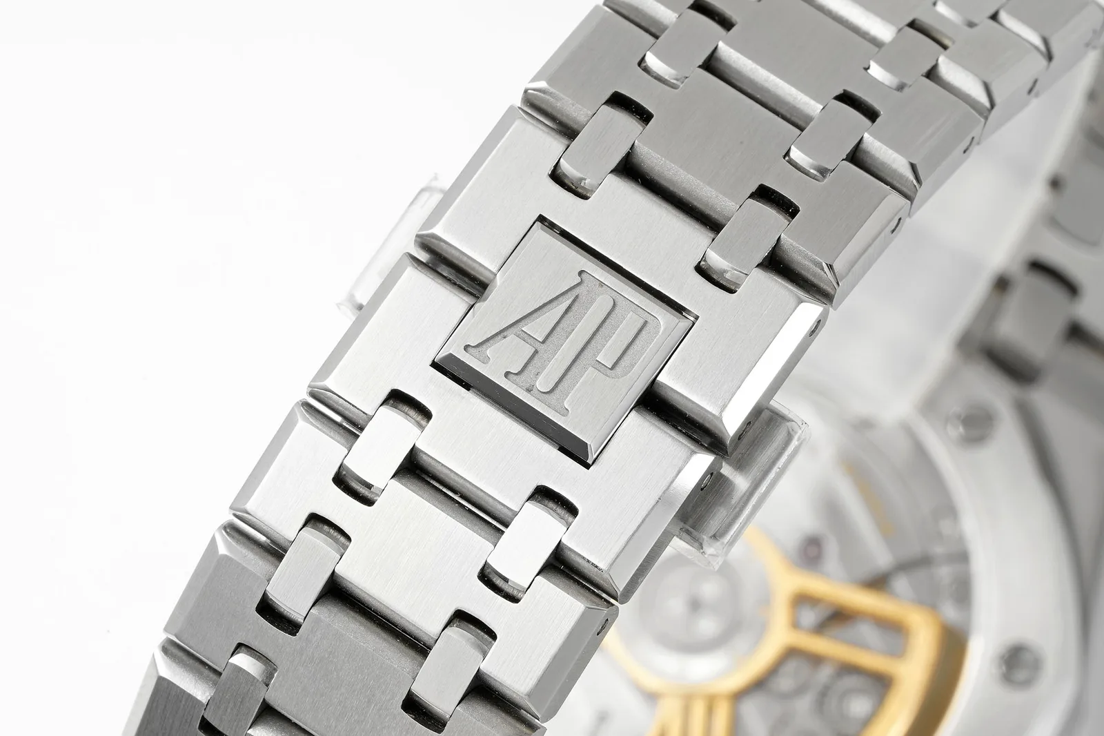
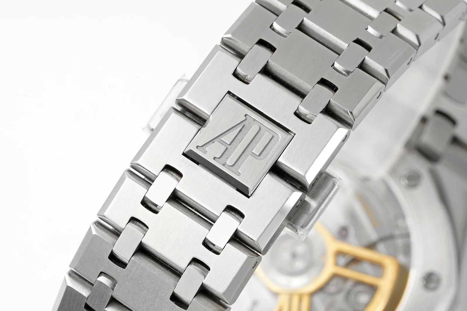
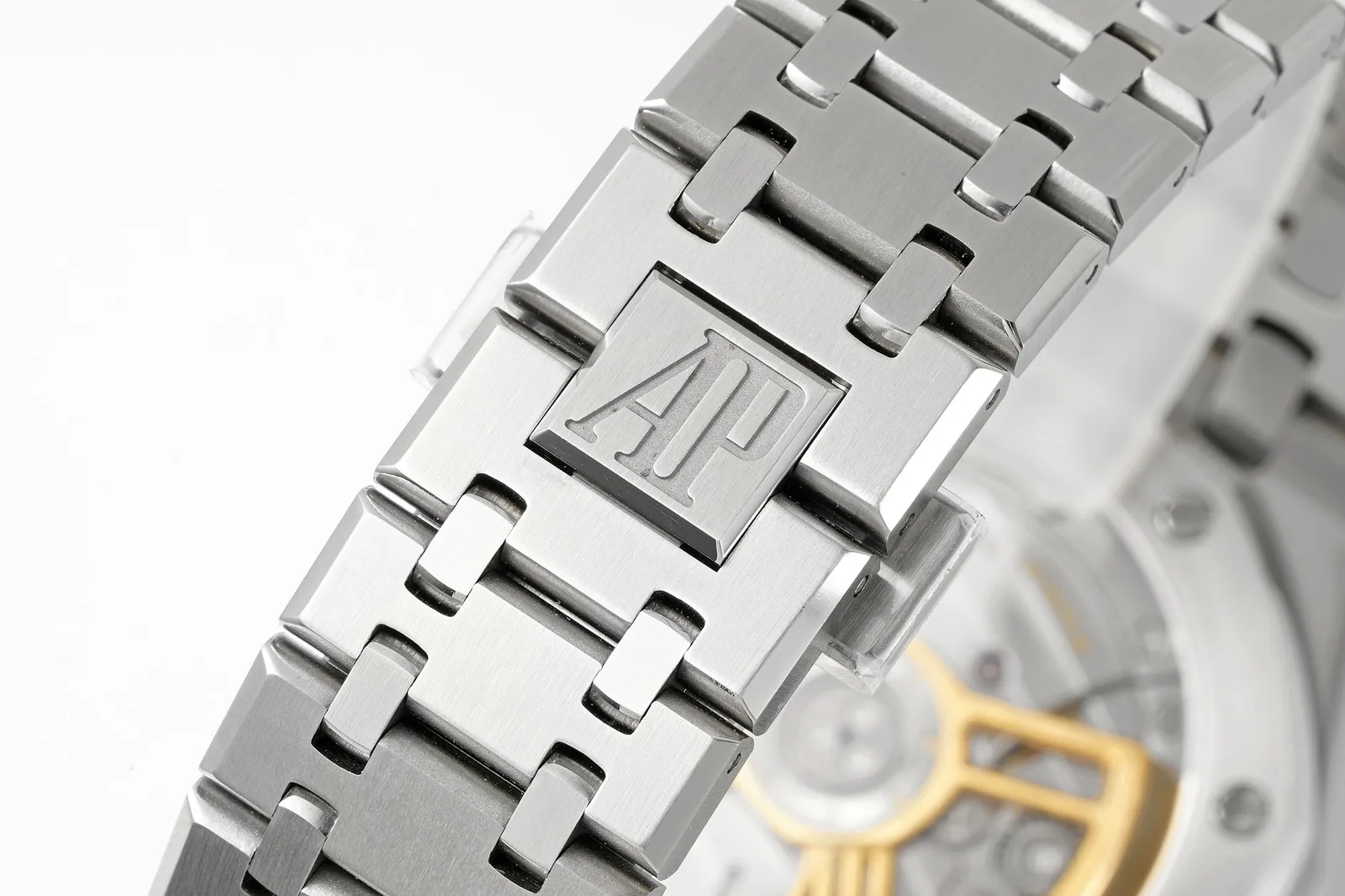
The case and bracelet get the most praise. A side-by-side comparison with VSF’s 15500 found the hands and markers on both very well polished. It noted that APSF’s bracelet has one more link, 24 in total, which may help larger wrists. The same comparison found APSF’s first link sits tighter against the case than VSF’s. That looks crisp, but it makes the bracelet slightly less flexible where it meets the case, so VSF’s may wear more comfortably on some wrists.
Finishing is the area where owners most often spend extra. One owner of an earlier APSF 15500 had the case, bezel and bracelet rebrushed and their edges polished by a watchmaker. He describes the difference as dramatic: no sharp edges, much more comfortable and more premium in feel. He singles out the polished bracelet edges as the change he notices most. That suggests the stock watch is good but slightly sharp, which is common for this reference at this price.
Dial details
On the grey version, the comparison found APSF’s dial slightly darker than VSF’s, with a stronger reflection at some angles. APSF’s lume plots on the markers are wider, and its date font is pure white and slightly thicker, where VSF uses a warmer white. These details should carry over to the white dial, although the date’s contrast obviously works differently on white. Check the date font against photos of the genuine watch.
The texture itself reportedly doesn’t change with any refinishing. The owner who had his blue dial recoloured notes that the pattern still differs from genuine under macro, though it isn’t something most people would notice.
Movement
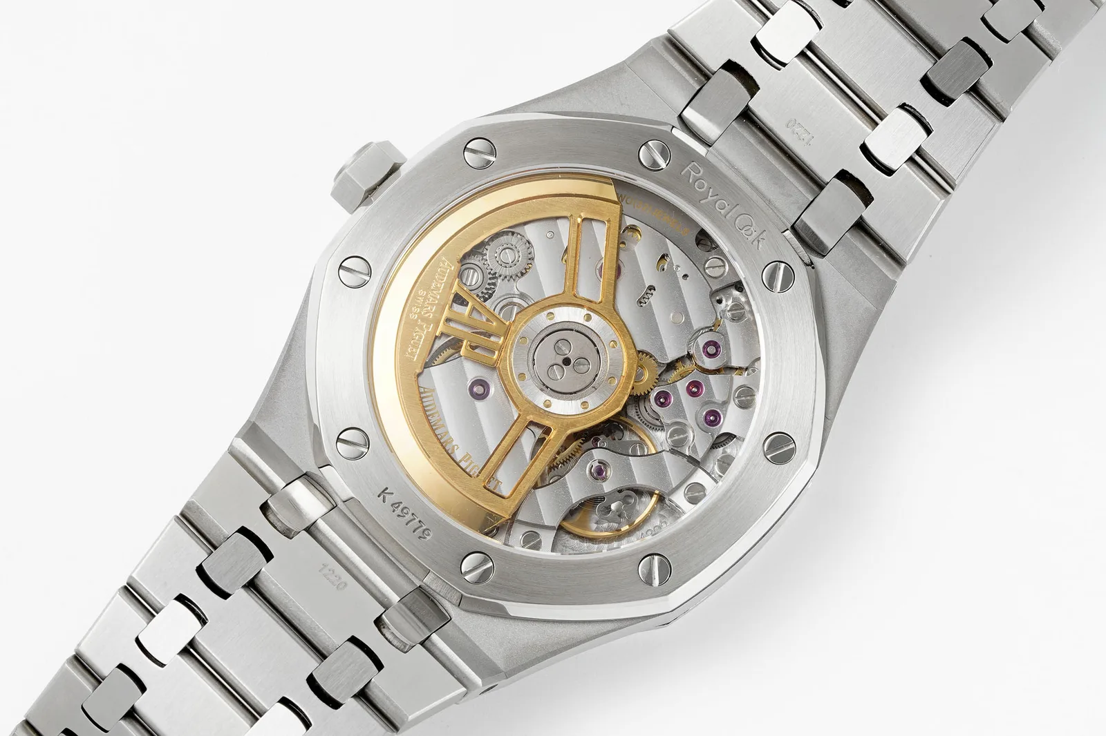
This is where the two most useful owner reports diverge, possibly because they describe different versions. The earlier owner’s watch arrived with a crooked logo at 12, a seconds hack that didn’t work, and a minute hand that jumped about two minutes when the crown was pushed back in. A watchmaker fixed all of that, and he describes the movement as smooth and quiet afterwards. These are quality-control issues rather than design flaws, but they’re worth checking.
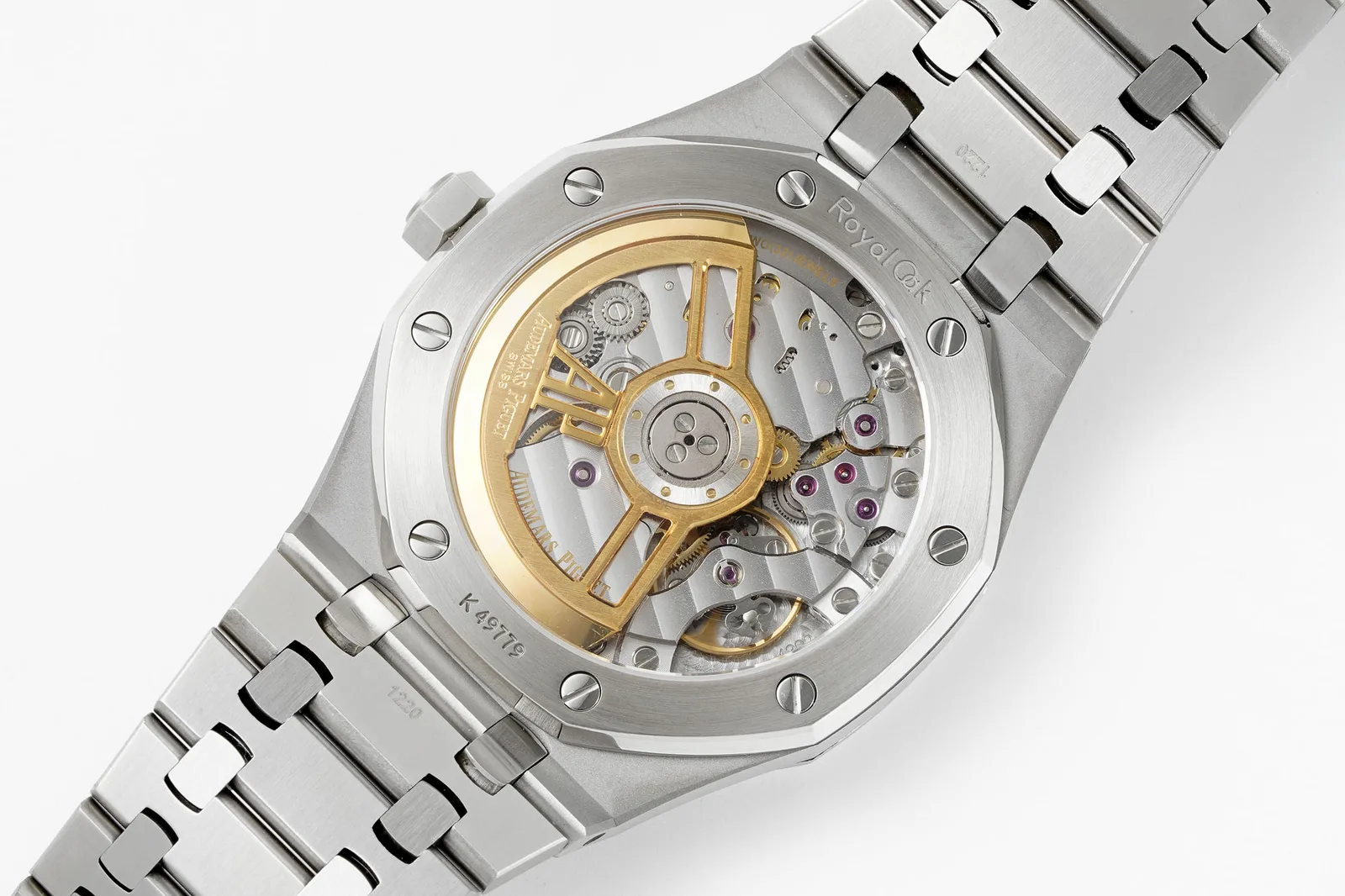
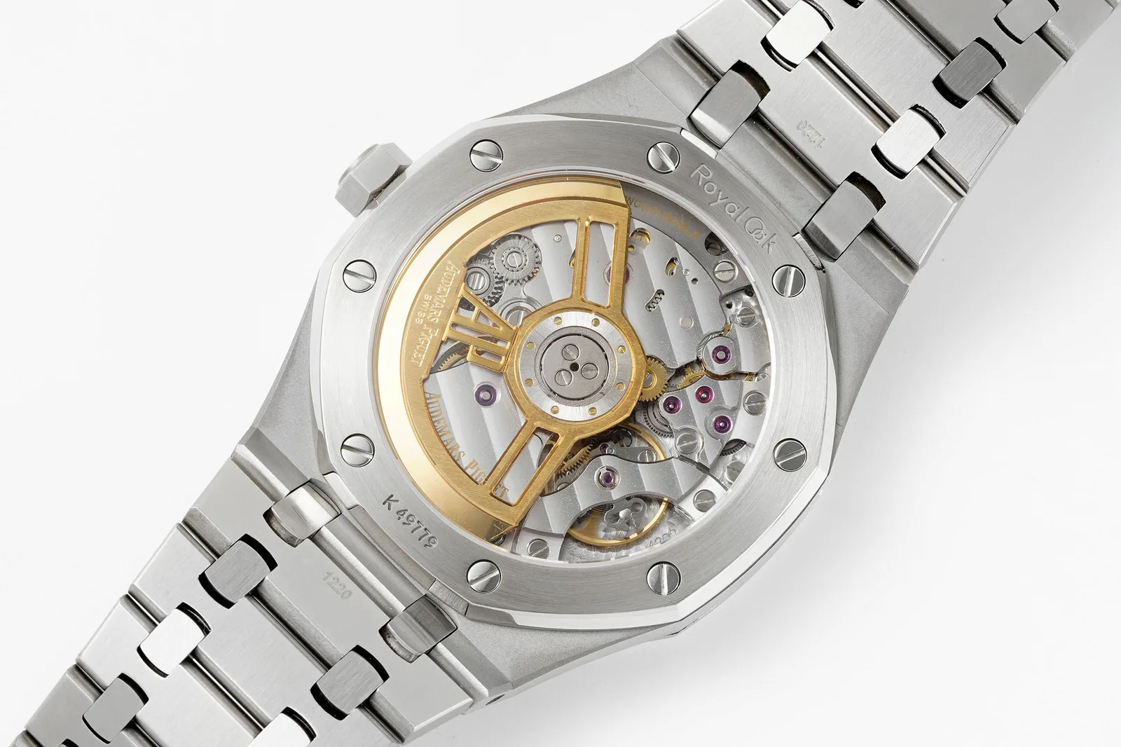
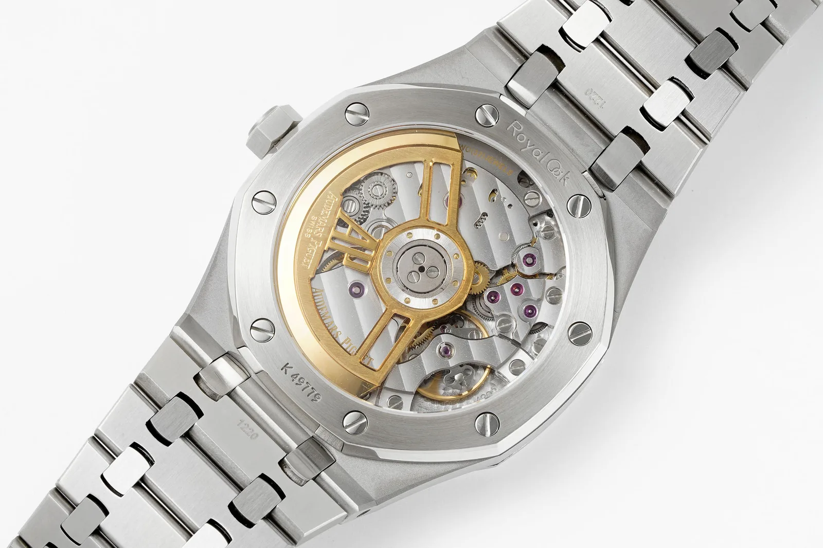
The comparison describes something newer: a 4302-type movement with a free-sprung balance and visible timing weights, which APSF had reportedly just introduced. VSF’s competing movement hides its regulator but reportedly has no weights on the balance, so APSF’s is arguably the more convincing version. One small detail: the comparison describes APSF’s rotor as rose-gold-coloured, with the logo in a more yellow tone, while VSF’s rotor colour was judged better.
Since a free-sprung balance has no regulator arm, adjusting the rate requires work on the balance itself, which takes a skilled watchmaker. Ask which movement version you’re getting, and request timegrapher results.
How it compares
VSF is the obvious rival, and on current evidence it’s close. APSF reportedly has the more convincing free-sprung movement, a longer bracelet and slightly bolder lume. VSF has a more flexible first link and a better rotor colour. Neither is clearly better. Choose based on which details matter more to you, and on how the individual watch looks at QC.
The trade-offs
The case, bracelet and movement are APSF’s strengths, and the white dial avoids the colour debates that follow the blue. The weaknesses are quality control and finishing: reports of a crooked logo, faulty hacking and a minute hand that moves when the crown is pushed in, plus edges that some owners find sharp until refinished. None of that is unusual, but it means a careful QC matters more than usual.
What to check before you accept one
- The logo at 12: make sure it’s straight.
- Seconds hacking: pull the crown and check that the seconds stop.
- Crown action: push the crown home after setting and check the minute hand doesn’t jump.
- Dial texture and the white tone in neutral light, and the date font.
- The fit and flexibility of the first link.
- Movement version (free-sprung or not), and timegrapher results.
The verdict
APSF’s 15500 is a strong version of a difficult watch, and the white dial is arguably the smartest way to wear it. Expect a good case and bracelet, possibly the better movement and a dial colour that’s far less contentious than the blue. Check the hacking, the crown and the logo carefully, and consider an edge polish if you want it to feel finished.
Royal Oak 15500
Product photos
White dial
Product photos
Blue dial
Product photos
Black dial
Product photos
Grey dial