ZF Black Bay 54 Lagoon Blue: A Small Diver With a Big Colour
ZF's 37 mm Black Bay 54 in Lagoon Blue reportedly nails the hardest part, the dial. Index alignment, the caseback and the bracelet edges are where to look.
In this review
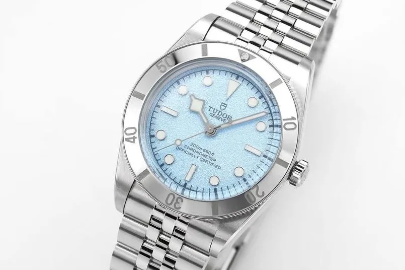
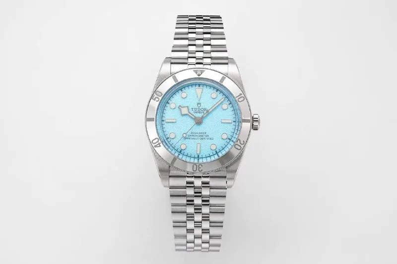
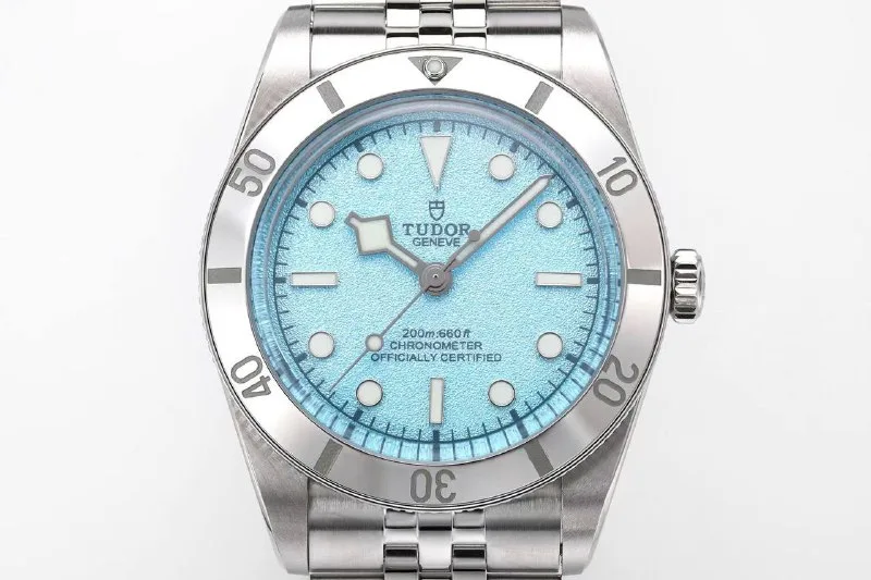
Some colours are easy to love and hard to make. Lagoon Blue is one of them. It’s a pale, milky turquoise with a fine texture, and it moves from icy to almost minty depending on the light. Get it slightly wrong and the watch looks like a toy. Get it right and a small steel diver suddenly becomes the most cheerful thing in the room.
That’s the challenge ZF took on with its copy of the 37 mm Black Bay 54 in Lagoon Blue. The factory first listed it late last year, and it has since become one of the more talked-about small divers in the replica world. The question most people ask isn’t about the movement or the bracelet. It’s simpler than that: is the blue right?
From what owners and comparison posts suggest, the answer is mostly yes. The rest of the watch is a more familiar story.
Why this watch, and why this size
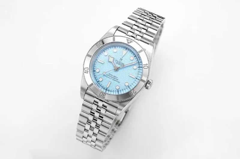
The Black Bay 54 exists because plenty of collectors decided modern dive watches had grown too big. At 37 mm, it’s a deliberate step back toward the proportions of early dive watches from the 1950s. The case is compact, the bezel is plain steel with a full 60-minute scale, and the dial keeps things simple: no date, large lumed markers and an angular, faceted hour hand.
On a small or medium wrist, that size is the attraction. Even a fairly modest 39 mm diver can look like a hockey puck on a slim wrist, and a 37 mm one simply fits. Promotional copy for the replica leans hard on this point, calling it a classic vintage-style diver with clean proportions and a fit that suits small wrists. Marketing copy deserves a raised eyebrow, but in this case the dimensions back it up.
The Lagoon Blue dial adds personality to a watch that’s otherwise quite serious. The genuine version reportedly sells briskly, and that combination of demand, a striking colour and a reasonable size makes it an obvious target for factories. ZF’s version appeared in catalogs as a “new” model with a frosted blue dial, and dealers seemed to have it in stock within weeks.
The dial: the reason to buy it
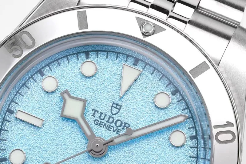
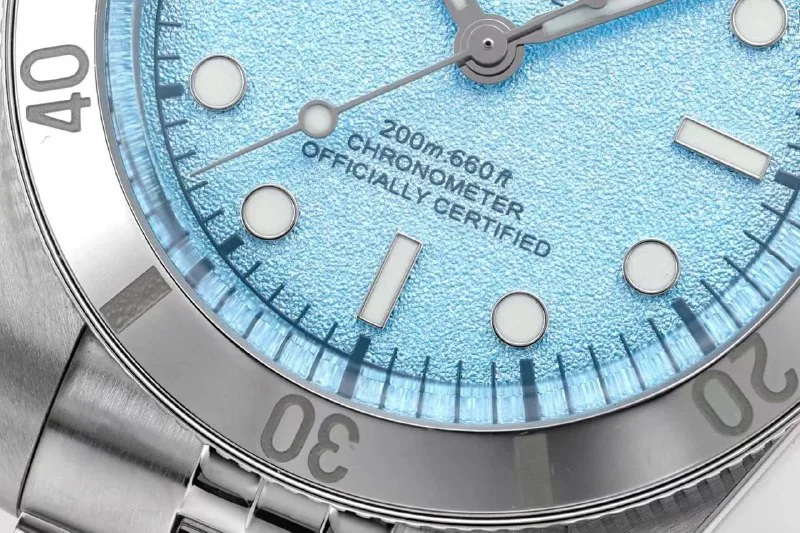
Everything here depends on the dial, so it’s worth starting there. A detailed side-by-side comparison of the genuine watch and the ZF version suggests the colour and texture are very close. One reader called it “scary close,” noting that this kind of pale turquoise is notoriously hard for factories to get right. Another owner went further and described the dial as almost indistinguishable from the genuine one.
There are small caveats. Some observers felt the genuine dial looks a little richer or deeper in colour, though they admitted lighting and shadow might explain the difference. Others pointed out that the lume plots on the replica look slightly flatter, and that the dial printing may be a fraction darker. The bezel numerals were also described as possibly a touch thicker. These are the kinds of differences you notice in a magnified comparison photo. On the wrist, owners seem to agree they’re minor.
The hands are a recurring complaint, and not just for this model. One commenter said that if they had to criticise anything, it would be the hands, which they see as a weak spot on many ZF pieces. It’s worth looking closely at the shape and finish of the hour hand in any QC photos.
Index alignment: the real QC battle
If the dial colour is the good news, index alignment is the catch. Across a run of QC posts, the same issue comes up again and again: the 3 and 9 o’clock markers sometimes look rotated or tilted, and the 6 and 12 occasionally do too. Several buyers asked whether this would be visible on the wrist. Experienced reviewers' answers ranged from “acceptable” to “I’d return it.”
One owner said misaligned markers are generally considered normal for ZF’s versions of this family of watches and suggested buyers simply decide how much tolerance they have. Another buyer reportedly returned a piece because the 6 o’clock marker looked noticeably off, even when viewed from across a room. A third accepted one with a slightly wonky 9 after deciding that a watch costing a few hundred dollars was never going to be flawless.
The practical advice is simple. Look at QC photos at actual size before zooming in. Heavy magnification exaggerates small errors, but a marker that looks wrong at normal size will probably bother you every day.
The bezel can cause similar worries. Several QC posts raised concerns about the bezel looking slightly rotated. Reviewers pointed out that the polished, sloping bezel reflects light in a way that can make it look misaligned in photos, and that a little play can shift it as well. It’s worth asking the seller to confirm alignment rather than assuming the worst.
Movement, case and bracelet
ZF lists the movement as an A2824. The good news is that timing reports look healthy. Owners have posted timegrapher readings from roughly -3 to +5 seconds per day, with solid amplitude and near-zero beat error. As always, a single reading on a timing machine isn’t the same as long-term accuracy, but it’s a reassuring start.
The factory claims a thickness of about 11.2 mm, which sounds reasonable for the size. We haven’t seen independent measurements, so treat that figure as a listing claim.
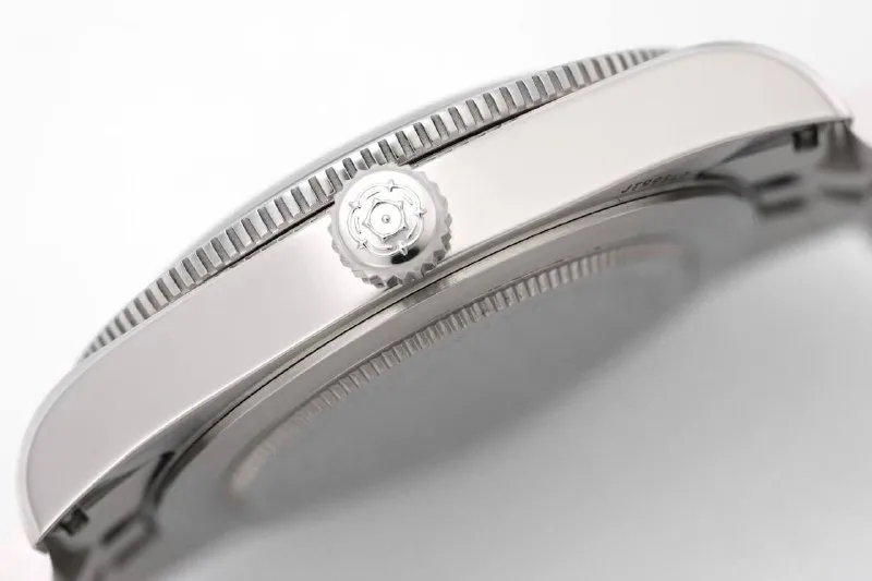
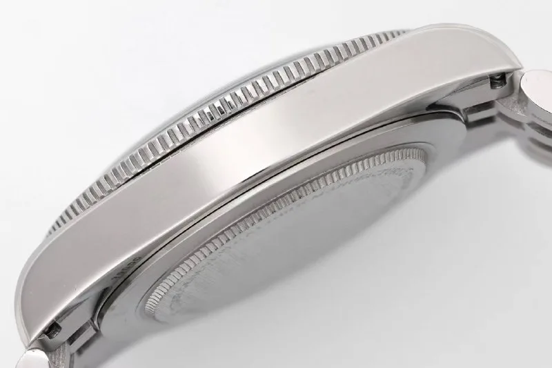
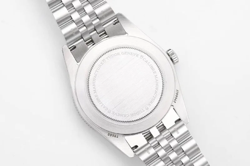
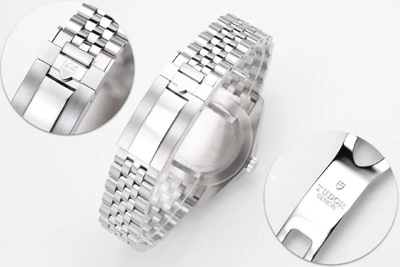
The case and bracelet are where owners report the most hands-on work. One owner described the bracelet edges as rough enough that they sanded them with fine paper. They also said the caseback and the teeth around its edge felt rough. Others noted that the caseback engraving looks a bit crude, and one pointed out that a circular detail found on the genuine caseback is missing. None of this affects how the watch looks from the front, but it’s the kind of thing you’ll notice when you take it off.
The perspective
What makes this replica interesting is that its biggest strength is also the hardest thing to copy. Many factories can produce a convincing steel case. Far fewer can mix a pale, textured turquoise that looks right in daylight. From the evidence available, ZF seems to have done exactly that.
The weaknesses are more ordinary: alignment that varies from piece to piece, rough finishing on the bracelet and caseback, and hands that may not satisfy picky buyers. That makes this a watch where QC matters more than the factory name. Two examples from the same batch could leave very different impressions.
Prices reported by buyers range from roughly $330 to $410 including shipping, which puts it firmly in mid-range territory. That’s fair for a watch whose dial is reportedly this convincing. It’s less of a bargain if you end up with a crooked marker that you can’t stop looking at.
What to check
- Index alignment: look closely at 3 and 9 first, then 6 and 12. View the photos at actual size before zooming in.
- Bezel: if it looks rotated, ask the seller to confirm. Reflections and slight play can mislead.
- Hands: check the shape and finish of the angular hour hand.
- Bracelet edges: expect some roughness and decide whether you’re willing to smooth it yourself.
- Caseback: look for rough teeth and engraving, and the missing circular detail.
The ending
Small divers are having a moment, and colourful dials are having another. ZF’s Lagoon Blue Black Bay 54 sits where those trends meet. It isn’t flawless, and the alignment lottery is real. But if you find a good one, you get a compact, well-proportioned diver with a dial that people will notice. Choose it the same way you’d choose the colour itself: carefully, in good light, and with your own eyes.
A closer look
View all 35 photos
Black Bay 54 37 mm
Factory lineup
Lagoon Blue and black dials, factory flyer

Product photos
Lagoon Blue dial
Hands-on
Lagoon Blue dial